Website revision for expanded unhoused individual access.

Overview
High friction, low clarity
Father Joe's Villages is a massive homeless services provider that offers a multitude of services. Due to capacity constraints, their resources have specific qualifications and limited availabilities. I had to identify available opportunities for pressing needs and describe processes in professional and realistic terms.
After working with Father Joe's Villages for 6 months on a communication tool (view case study↗), my collaboration with the nonprofit was extended with a solo internship where I revised this informational page directed at unhoused people:
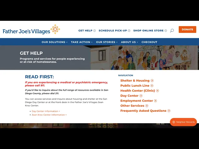
Original website, June 2025
The Problem
Streamlining the Convoluted Page
The official website is outdated and underdeveloped due to tight nonprofit budget constraints. I was tasked with focusing on the "Get Help" page, the first place where an unhoused individual would land. Throughout the next four months, my goal was to determine: How can this page be optimized for navigational flow; breaking down complex information in a digestible manner?

Findings: Unhoused Client Needs


The most critical hurdle was getting started in looking for resources. The complicated UI, longwinded text, and a massive website with many isolated subpages only created friction in this process.
My redesign needed to create intuitive pathways in sharing information to reduce cognitive load.
Findings: Outreach Staff Needs
Father Joe's Villages mission is based on a three-pronged approach: housing, healthcare, and employment. Due to this, there are many separate departments that work closely together. To get the clearest holistic picture, I interviewed these workers:
Day Center Team, who I shadowed weekly
Communication Department, the team I visited and reported to weekly
Chief Financial Officer (my client)
Street Health Team nurse practitioners, who let me shadow the street health van
Health Center Clinic workers
Outreach workers
Case Managers
Shelter and transitional housing team
Employment Center team
Traveler's Aid Society (transportation support) team


These interviews emphasized the need to balance simplicity with detailed instructions: I had to shorten and personalize content writing, structure intuitive IA, and write clear CTA’s. This could make complex information easier to scan, offer intuitive pathways to relevant resources, and communicate the human face of the organization.

Prototype

Longwinded Page to
Concrete Steps
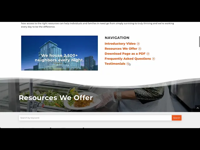
I decided to begin the page with a video introduction with a transcript for accessibility and the option to skim the video's contents.
I consolidated the old page's sections into a card-style resource library.
Scroll the prototype! →
Iterations
Incorporating Cross-Departmental Insights
I began user testing my MVP primarily with outreach staff, case workers, and people experiencing homelessness. Some feedback I incorporated:
Ensuring all information can be quickly reached on this singular page.
Rather than a personalization quiz, the dropdowns were particularly helpful since they showed all information options available.
Elements aiming to put a human face to the organization and its mission, such as photos of FJV staff and the introductory video, were very well-received.
The Final Website
Browsing Made Easier, Broadening Access to Care
Although not yet live, here is the final website page redesign:
Reflection
Learning Outcomes
I learned how to be a self-starter and take initiative in reaching out to different departments at Father Joe's Villages.
Gained further practice in shadowing and informational interviews.
Improved my ability to extend existing brand identities.
Strengthened my specificity and thoroughness of content writing.
Future Improvements
If I were to revisit this work, I would:
Add more graphics, visuals, and iconography. Father Joe's Villages has a style guide but few graphics besides their logo.
Take updated photos of teams.