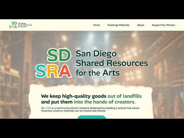
Giving San Diego's Art Community a Place to Share

Giving San Diego's Art Community a Place to Share

Designing a creative reuse nonprofit's first-ever website, turning scattered informal networks into a platform artists and theaters actually trust.

MY ROLE

MY ROLE

Product Designer
Visual Designer

Product Designer
Visual Designer

Product Designer
Visual Designer

TEAM

TEAM

1 Product Manager
1 UX Researcher
2 Designers

4 Designers


1 Product Manager
1 UX Researcher
2 Designers

TIMELINE

TIMELINE

Apr 2026 - Jul 2026
(4 months)

Apr 2026 - Jul 2026
(4 months)

Apr 2026 - Jul 2026
(4 months)

TOOLS

TOOLS

Figma, FigJam, Wix

Figma, FigJam, Wix

Figma, FigJam, Wix

Overview

A Fast-Growing Nonprofit

San Diego Shared Resources for the Arts (SDSRA) is a nonprofit working to redistribute creative materials to schools, theaters, and individual artists across San Diego. SDSRA has identified community demand: swap meets and survey data show resource sharing behaviors already exist, but the current ecosystem is scattered and informal.

SDSRA lacks a clear, scalable public presence for creatives, arts organizations, donors, and community partners to understand or engage with its mission. This limits participation and slowing its development from a promising initiative into a trusted regional resource. 

MY ROLE

Product Designer
Visual Designer

TEAM

1 Product Manager
1 UX Researcher
2 Product Designers

TIMELINE

Apr 2026 - Jul 2026
(4 months)

TOOLS

Figma, FigJam, Wix

The Problem

Building Trust from the Ground-Up

Our task was to design SDSRA's first website from scratch. We faced the challenge of designing for a community-driven exchange built on trust. Our team wondered:

How might we establish credibility for both established recyclers and newcomers, communicate broader impact beyond material exchange, and make engagement feel low-barrier and worth returning to?

UX Research

Delving into the Community

We interviewed artists, theater professionals, and existing SDSRA participants. We were surprised by the role of community beyond transactions. We expected users to care about access to materials as their first priority, and definitely didn't expect ho they described wanting events, newsletters, creative spaces, and connection.

Delving into the Community

UX Research

One participant described the gap they hoped the creation of SDSRA could fill:

"An active and engaging community — newsletters, Instagram, giveaways, events… not just to trade but to connect."

This reframed the project to extend beyond a resource library into a community hub that drives material exchange.

Competitive Analysis

From these analysis, I learned to balance emotional community content (testimonials, photos, participant voices) with practical resource discovery (inventory previews). While research prioritized community, a purely communal site risks feeling vague.

To solve this, I used community elements to build trust, while keeping CTAs and navigation focused on direct action. This strategy created a warm and actionable user experience.

User Flows

Intuitive Pathways that Reduce Friction

General Public Flow

Donor Flow

Prototype

Hello, world! Demystifying SDSRA's Mission

Our team created mid-fidelity and high-fidelity prototypes. We prioritized the desktop interface due to our research.

Creative Ecosystem

On top of serving as a resource hub, SDSRA's value came in the form of the kind of creative ecosystem it was trying to create. The site needed to make that ecosystem feel real and worth joining, and impress upon the viewer the importance of SDSRA's mission values.
Three priorities guided everything from page structure to copy to CTA placement:

Creative Ecosystem

On top of serving as a resource hub, SDSRA's value came in the form of the kind of creative ecosystem it was trying to create. The site needed to make that ecosystem feel real and worth joining, and impress upon the viewer the importance of SDSRA's mission values.
Three priorities guided everything from page structure to copy to CTA placement:

PRIORITY

Make the mission legible fast


Build trust before asking for any action


CTAs match commitment level

Make the mission legible fast


Build trust before asking for anything


Match CTAs to commitment levels

The homepage follows a clear narrative arc: mission, how the exchange works, community proof, call to act, so first-time visitors don't have to work to understand SDSRA's purpose.


Donating materials requires believing an organization will use them well. The About page leads with SDSRA's origin, leadership, and nonprofit transparency for credibility.


Not every visitor is ready to donate. We designed a tiered entry system: Browse Resources, Join the Exchange, Stay Connected, Donate or Support. Lower-stakes actions come first, letting users ease into participation.

HOW IT WAS IMPLEMENTED

The homepage follows a clear narrative arc: mission, how the exchange works, community proof, call to act, so first-time visitors don't have to work to understand SDSRA's purpose.


Donating materials requires believing an organization will use them well. The About page leads with SDSRA's origin, leadership, and nonprofit transparency for credibility.


Not every visitor is ready to donate. We designed a tiered entry system: Browse Resources, Join the Exchange, Stay Connected, Donate or Support. Lower-stakes actions come first, letting users ease into participation.

HOW IT WAS IMPLEMENTED

Design System

Visual Identity for a Blank Slate

My rationale behind the color system was utilizing the three primary colors to signal SDSRA's hand in artistic processes. The green was added in for its eco-friendly connotation. It is featured in our design to spotlight when sustainability is mentioned.

Iterations

Variations for Client Requests

Our clients at SDSRA loved the color scheme and flow of the pages. They requested for:

  • Sans-serif, rounded fonts that are bolder for higher contrast

  • Text use over graphics, they ultimately preferred a text logo and and CTA > graphics

  • Use of playful and bright color scheme

  • A shared catalog section they would later implement

Design System

Visual Identity for a Blank Slate

My rationale behind the color system was utilizing the three primary colors to signal SDSRA's hand in artistic processes. The green was added in for its eco-friendly connotation. It is featured in our design to spotlight when sustainability is mentioned.

The Final Website

A Centralized, Reliable Community

The final site positions SDSRA as a trusted creative resource rather than a swap meet calendar with a URL. It gives the organization a platform to communicate impact, grow its community, and shift public perception of creative reuse from charity to infrastructure.

This scalable design also leaves room to grow. As SDSRA progresses, they can add member profiles, request forms, mailing lists, and a blog as natural extensions of our structure.

Design System

Visual Identity for a Blank Slate

My rationale behind the color system was utilizing the three primary colors to signal SDSRA's hand in artistic processes. The green was added in for its eco-friendly connotation, and is featured in our design to spotlight when sustainability is mentioned.

MY ROLE

MY ROLE

Product Designer
Visual Designer

TEAM

TEAM

1 Product Manager
1 UX Researcher
2 Designers

TIMELINE

TIMELINE

Apr 2026 - Jul 2026
(4 months)

TOOLS

TOOLS

Figma, FigJam, Wix

Reflection

Learning Outcomes
  • Cross-functional Collaboration: Navigated diverse team schedules and conflicting expectations by practicing active communication and conflict resolution to reach ideal compromises.

  • 0-to-1 Brand Identity: Established the end-to-end digital presence for a blank-slate nonprofit organization with no visual identity. Defined the information architecture, narrative flow, and content strategy to shape the organization's public perception.

  • Bridging Research and Execution: Translated ambiguous user insights—specifically a need for community emphasis—into concrete layout decisions, balancing data-driven insights with strategic design intuition.

Broader Implications: Creative Access as Infrastructure

Material cost is an under-discussed structural barrier to creativity. SDSRA treats material redistribution not just as charity, but as essential infrastructure for underfunded creative communities. By lowering barriers, the platform democratizes creative access for students, nonprofits, and under-resourced schools.

Future Improvements

If I were to revisit this work, I would:
  • Add playful animations and interactions

  • Refine and further detail the branding identity as SDSRA grows into its visuals

  • Invest more heavily in inventory discovery, event previews, and material categories, the functional layer that the research pointed to as a major usability gap.

Thank you for reading my case study!
See more of my journey as a designer and creative:

Thanks for reading my case study!
See more of my journey as a designer and creative:


Reflection

Learning Outcomes
  • Cross-functional Collaboration: Navigated diverse team schedules and conflicting expectations by practicing active communication and conflict resolution to reach ideal compromises.

  • 0-to-1 Brand Identity: Established the end-to-end digital presence for a blank-slate nonprofit organization with no visual identity. Defined the information architecture, narrative flow, and content strategy to shape the organization's public perception.

  • Bridging Research and Execution: Translated ambiguous user insights—specifically a need for community emphasis—into concrete layout decisions, balancing data-driven insights with strategic design intuition.

Broader Implications: Creative Access as Infrastructure

Material cost is an under-discussed structural barrier to creativity. SDSRA treats material redistribution not just as charity, but as essential infrastructure for underfunded creative communities. By lowering barriers, the platform democratizes creative access for students, nonprofits, and under-resourced schools.

Future Improvements

If I were to revisit this work, I would:
  • Add playful animations and interactions

  • Refine and further detail the branding identity as SDSRA grows into its visuals

  • Invest more heavily in inventory discovery, event previews, and material categories, the functional layer that the research pointed to as a major usability gap.

Thank you for reading my case study!
See more of my journey as a designer and creative:

Thanks for reading!
See more of my journey as a designer and creative: